Fantasy Life
Scaling Design Systems & Player Web Experience
UX/UI Designer during Fantasy Life’s MVP stage transforming existing landing pages into a scalable product experience for fantasy football players. Fantasy Life’s platform delivers personalized insights, tools, and content for premium fantasy football players. I designed new product screens, refined the design system, and created interactive prototypes using Figma while collaborating with the Head of Growth, engineers, and product team. Together we streamlined the user experience to increase user engagement, usability, and design consistency.
Client
Fantasy Life
Service Provided
Web Design, Design System
Deliverables
High-Fidelity UI Screens
Wireframes
UI Components
Component Specs
Prototyping

The Outcome:
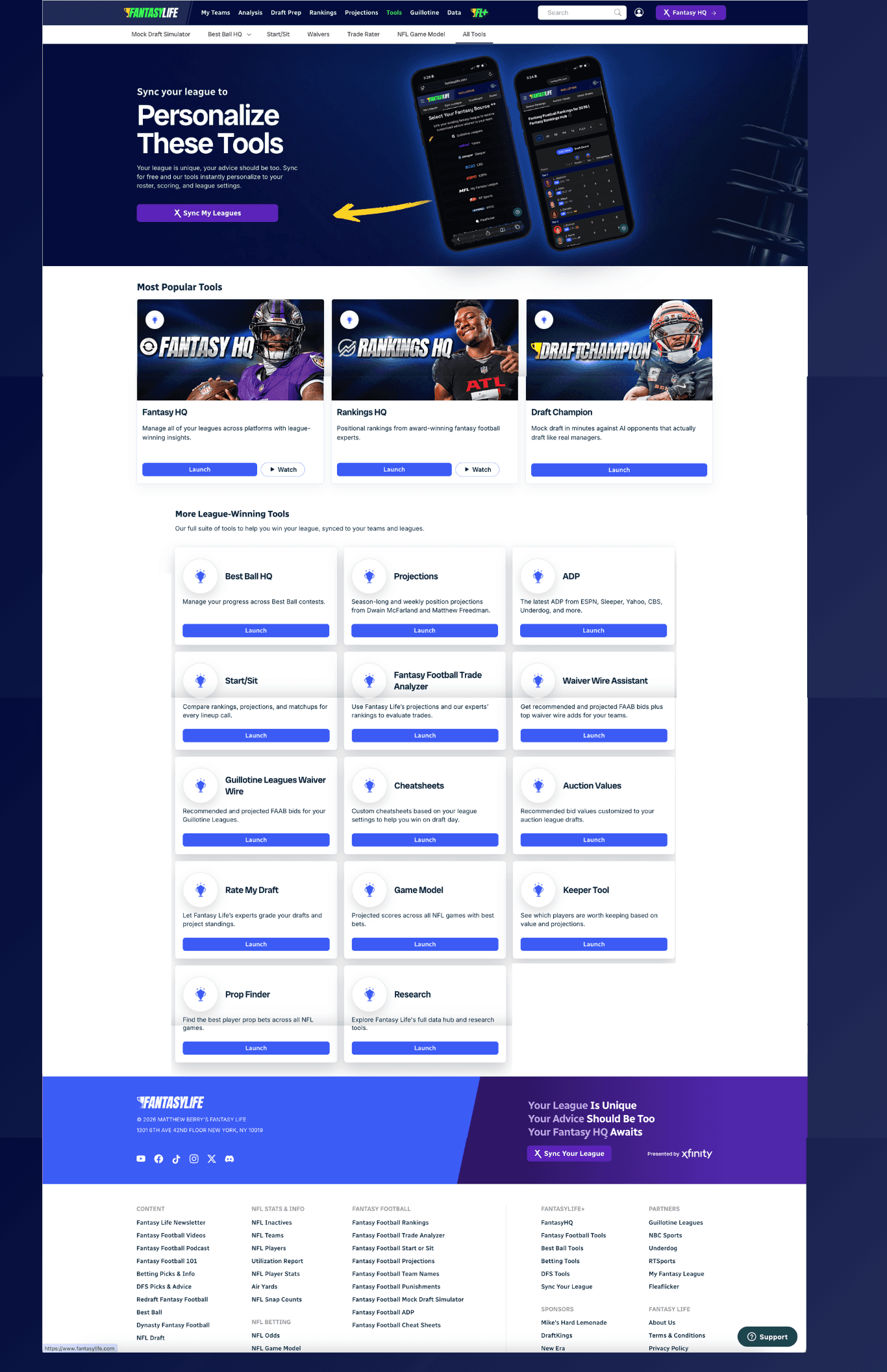
The redesigned landing pages improved active user tool discovery by helping users navigate Fantasy Life more efficiently and spend less time searching for key features on their first visit. To support this experience, we refined the design system with reusable components that streamlined consistency across existing pages making the platform feel more cohesive while improving build time for future design updates.
Shipped Examples: (Before + After) Legacy Tools Landing Page & Refreshed Tools Landing Page
10%
Increased Premium User Engagement
15%
Improved Premium User Retention

Product: Preventing Landing Page Missed Actions
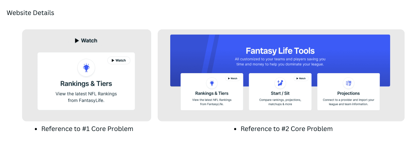
When I joined, the tools page had a functional yet limited interface. I was able to work with the Head of Design and product team to identify core problems to begin tackling the redesign:
General Confusion on Promotional Video Placement*
Friction for Critical pillar tools that should stand out*
Lack of clarity on Premium Insights provided
No navigation to services/offers cross-platform
My Design Method
My design approach involved presenting 2 design concepts and together we selected 1 that I amplified into the creative direction. The selected concept included component variations, credible photography, establishing iconography, and streamlining typography for the overall look on the web. The tradeoff for the chosen design prioritized long-term accessibility & navigational options within brand styling while deprioritized styling stigma’s.
Post-presenting to stakeholders I underwent 1 major revision with a bold new direction before receiving final team agreement. The next task was to improve wireframes and mapping out the user’s journey so users can re-engage with Fantasy Life’s key product offerings and visually outline the overall site structure via Figma.
System Approach Solving: The solution upheld Fantasy Life’s brand consistency, improved UI components for scalability, and strengthened CTA placement to help active users access videos and engage with insights faster and more intuitively.
Shipped Examples: Redesigned Tools Landing Pages with new interface design
Notable Updates
After redesigning the Tools page and establishing new components, I designed non-existing pages (Research) applying the new component variations that revealed new unexpected challenges; NFL Team Page Section.
Shipped Examples: Example AI-Proposed Reference for Research Page
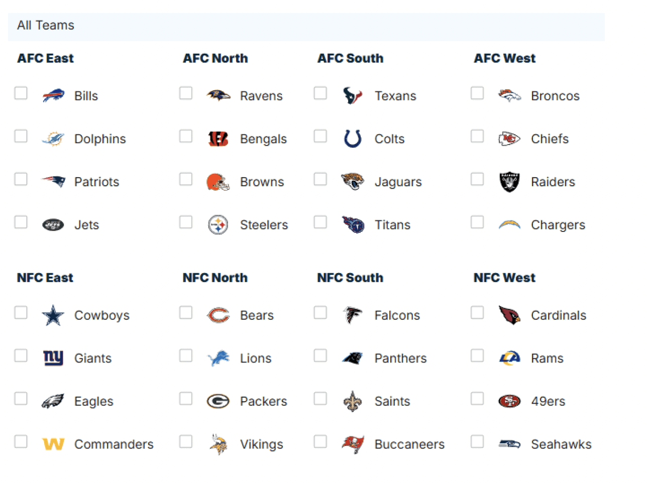
Upon further design review the 2 NFL divisions displayed in separate sections unintentionally forced excessive page scrolling. Since this is a key offer, I worked closely with the Head of Design and we solved this by introducing a default divisional view for all users on first visit paired with segmented controls to give users immediate access & personalize their view without unnecessary friction.
System Approach Solving: The original layout treated the NFL Team Page Section as a static content block without awareness of the user or their intent on arrival. The redesign solve giving returning users a faster path to personalized team insights while establishing reusable components that balances full content visibility with personalized selections across the platform.
Shipped Examples: Research Landing Page with NFL Divisional Table

Up close Site View: Key Offer - Team Pages Flow

Product: Evolving the Design System While Preserving Trust
As we shift into the final task, I initiated my journey of conducting an evaluation of the existing UI elements. Not long after, I spotted inconsistencies spanning from iconography, color palettes to content blocks, and button style choices. The challenge here was that previous designs stemmed from a mix of multiple freelance contributors and internal designers. Moreover making sure all screens existed in Figma bridging the gap between design and engineering was essential.
My Design Method
My overarching objective was to establish a robust foundation that would sustain existing designs and expedite shipping new design features. I build out styles that were established from the initial Tools page. Naming Conventions and Design Tokens were a big part of system organization and becoming dev-ready. Detailed documentation of these styles live directly in Figma.
Subtle yet impactful modifications, including rectifying color discrepancies, ensuring uniform typography choices, refining spacing guidelines, building modular card variants, documented status alerts and suggested interaction states.
System Approach Solving: Curating a design library within Figma enhanced the existing UI while minimizing design-related debt. This approach translated the design system into a tangible asset for the engineer team, creating a more seamless process for design updates and improving sprint progress.
Shipped Examples:
Snippet of Design Library with Key Content Block Variations

Closing Remarks
This case study represents a curated snapshot of my work designing scalable design systems and intuitive web experiences across B2C systems. This reflects how I approach complex, real-world problems where clarity, trust, and scale are critical. For continued care I focus on designing products as systems with both users and business growth in mind.