MenUp
Branding for an Education Consulting Company
MenUp is a Educational Consulting Company focusing on education reform and social justice in underrepresented schools based in New York City. With 200 growing podcast listeners and supporting multiple schools leadership within NYC public school system they’re seeking to reimagine their visual presence for brand partnerships & new engagements across the school district.
Client
Christian Shaboo
Service Provided
Branding
Deliverables

The Goal:
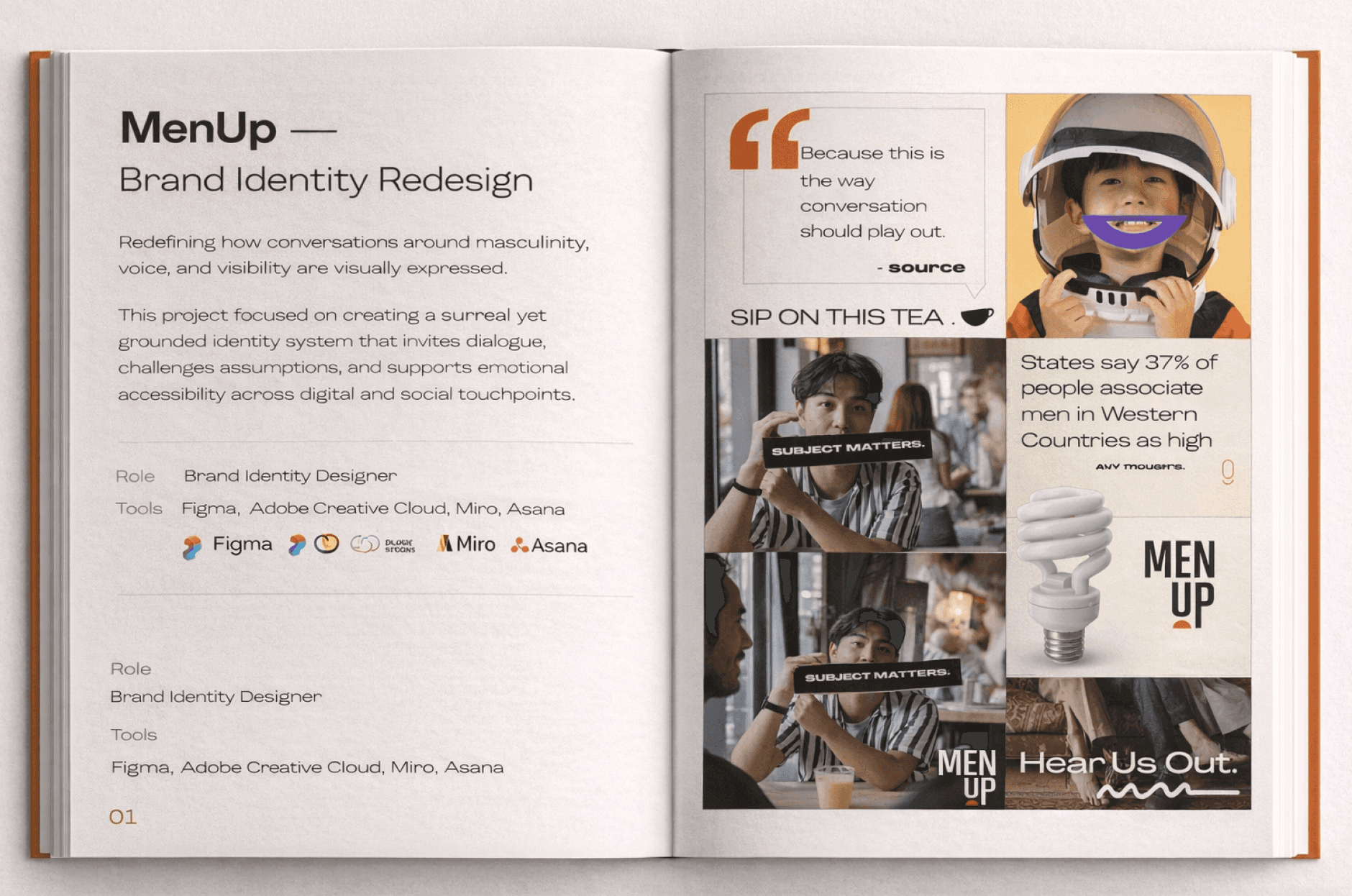
I Redefined MenUp’s visual identity to better connect with prospective clients and attract larger partnership opportunities. The goal was to rebrand for a surreal, supportive, and a-typical visual language that spoke directly to the men they serve—standing apart from traditional education and social reform aesthetics. As the sole Visual Designer, I was responsible for brand strategy research, brand positioning, marketing collateral, and a brand style guide for clarity and messaging. I worked closely with the Founder, Copy team, and Board of Directors to align strategy for clarity, messaging for engagement, and a creative visual direction.
36%
Increased Accuracy for Leads
100%
Improved Organic Traffic for Brand Partnerships

Brand Strategy Research
We met to dive into the companies problem and understand their “why” behind a redesign. After facilitating some working sessions with the MenUp team we identified a couple of their largest pain points:
General confusion on what MenUp does & how
Minimal Social Traffic + Engagement cross-platforms
Lack of Clarity on services/offerings provided
Dependent on third-party marketing material for print & digital propositions
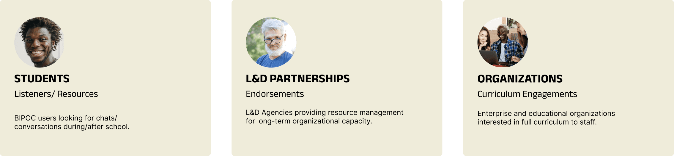
It took a collaborative effort to identify core groups MenUp needed to serve and honed in whose being left out. Their primary groups included:
We aligned on creating a strategic plan to improve their visual presence by streamlining their content, mapping their brand approach, and developing a visual audit deck with SWO analysis that can help their brand stand within the market and visually stand out effectively.
The challenge surrounded being primarily known for chats/conversations and their podcasts via Spotify while also communicating their key product offerings. This discovery helped center which user groups best suited their product offering long-term in order to prioritize them and their journey in the entire brand framework.
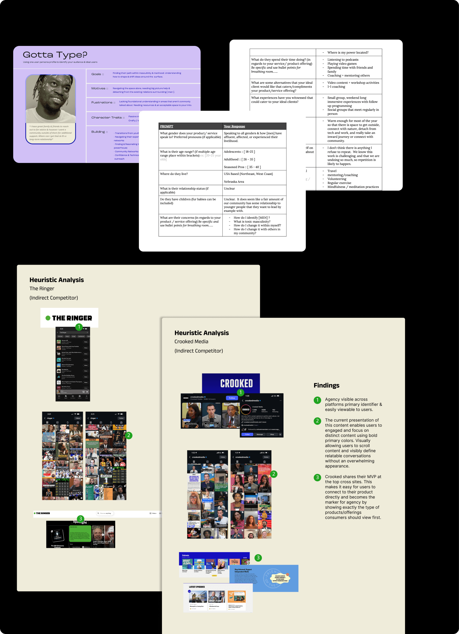
Brand Positioning
For the next task we focused on MenUp’s current visual treatment and began understanding the missing alignment for their target audience. To translate this into visual language we compiled their targets supporting markets against their current platforms to understand how to strengthen MenUp’s visual positioning.

Brand Style Guide
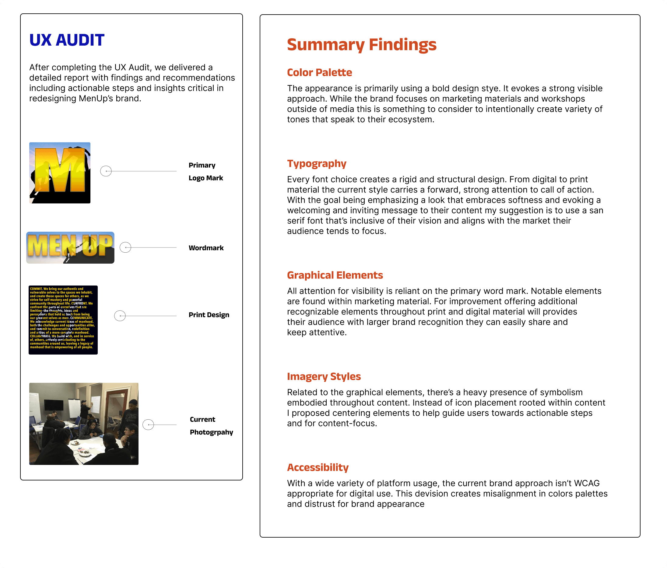
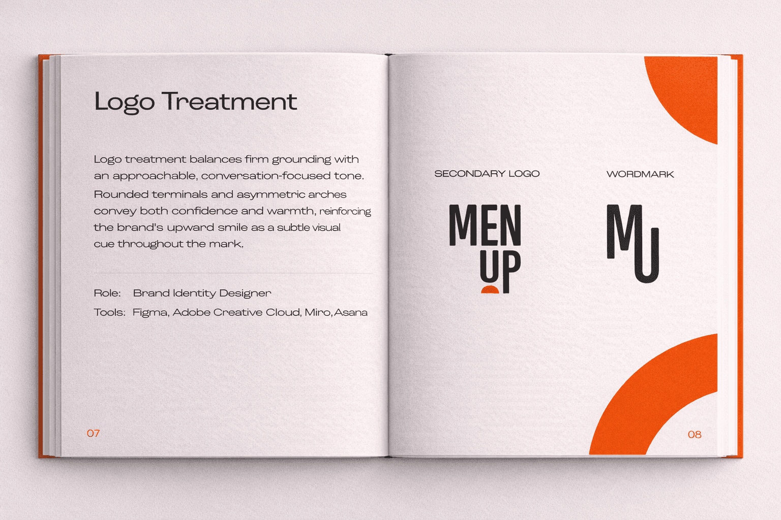
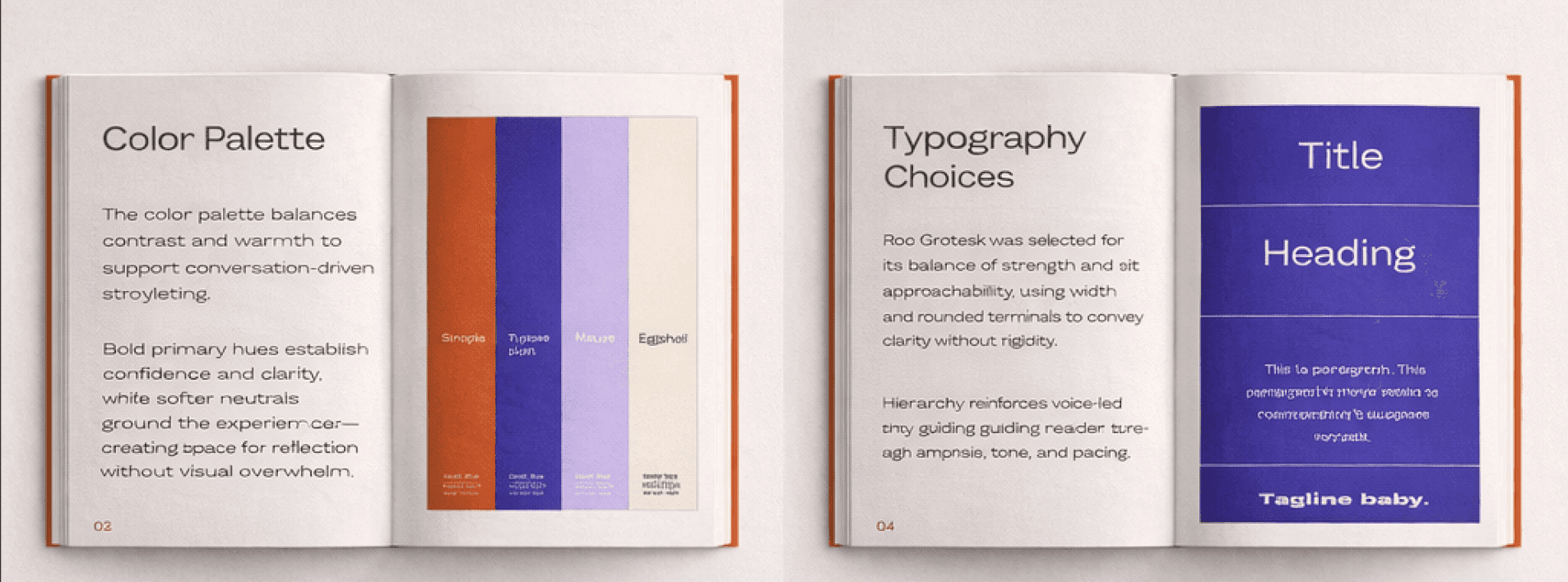
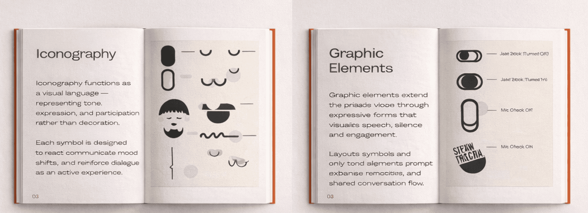
The next tasks was to refresh the brand identity I developed 3 concepts and together we selected 1 that I amplified into the creative direction presentation. Based on findings from our UX Audit, the selected concept included creating a softer logo design with variations, establishing iconography, streamlining typography and credible photography for how this could overall look. The trade off for the chosen design deprioritized social stigmas in visual language and focusing on long-term marketing with a light-hearted brand style that evoked a visual conversation.
Post presenting to stakeholders and pushing for an a-typical, bold new direction I underwent 1 revision before receiving final team agreement. I then created MenUp’s comprehensive brand style guide and templated their digital & print documentation via Figma.
Reflections
Post brand launch, MenUp experienced visibility, credibility, and high-demand for their services. The new brand approach helped secure 2 platform endorsements, increase podcast listeners by 30 viewers, and improved social growth across Instagram, Facebook, and Twitter by 10%. The refreshed creative direction & positioning also led to invitations to NYC leadership and development conferences, expanding MenUp’s partnership opportunities and industry reach.
The A-Typical Education visual direction shocked existing supporters in a good way while attracting new audiences. Founder Christian Shaboo & his team gained clarity and confidence in their brand and excited their vision aligned with the audience they intended to impact.

